Yes yes I know. I was just asking whether you have completed those things or not. And this icon can be used when we pause any workout
View attachment 14973

RES Galaxy Watch 3 (One UI 2.5) Beta theme for Mi band 4 v93 to v97
- Thread starter He5am2099
- Start date
- Resources Version
- 97
- Joined
- Nov 25, 2020
- Messages
- 48
- Likes
- 18
- Points
- 18
Here are some ideas for your theme-
• After One UI 3 update, the wind down feature (DND option in samsung phones) is renamed to bedtime mode. So if you rename DND option in Mi band 4 to bedtime mode instead of good night mode, it would be better and sync perfectly with One UI phones
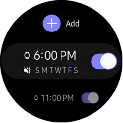
• One UI uses circle buttons when we have to select one thing from multiple options (eg- selecting ringing tone, notification sound) whereas,
 switches are used when we have to turn something on or off . So it makes no sense to put circle buttons in alarm as we have to turn them on or off, not select any one of them.But for dnd,circle buttons are correct as we have to choose one from 3 options
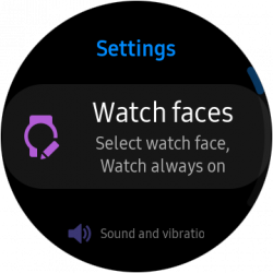
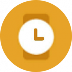
• Icon of watchfaces (band display) looks odd one out because it has gradient colors and all other icons in more section have flat colors. And I think these icons would look better for watchface icon

• After One UI 3 update, the wind down feature (DND option in samsung phones) is renamed to bedtime mode. So if you rename DND option in Mi band 4 to bedtime mode instead of good night mode, it would be better and sync perfectly with One UI phones
• One UI uses circle buttons
when we have to select one thing from multiple options (eg- selecting ringing tone, notification sound) whereas,
switches are used when we have to turn something on or off . So it makes no sense to put circle buttons in alarm as we have to turn them on or off, not select any one of them.But for dnd,circle buttons are correct as we have to choose one from 3 options• Icon of watchfaces (band display) looks odd one out because it has gradient colors and all other icons in more section have flat colors. And I think these icons would look better for watchface icon
Attachments
-
 940 bytes Views: 0
 -
 940 bytes Views: 0
Here are some ideas for your theme-
• After One UI 3 update, the wind down feature (DND option in samsung phones) is renamed to bedtime mode. So if you rename DND option in Mi band 4 to bedtime mode instead of good night mode, it would be better and sync perfectly with One UI phones
• One UI uses circle buttons View attachment 14981 when we have to select one thing from multiple options (eg- selecting ringing tone, notification sound) whereas, View attachment 14984 switches are used when we have to turn something on or off . So it makes no sense to put circle buttons in alarm as we have to turn them on or off, not select any one of them.But for dnd,circle buttons are correct as we have to choose one from 3 options
• Icon of watchfaces (band display) looks odd one out because it has gradient colors and all other icons in more section have flat colors. And I think these icons would look better for watchface icon View attachment 14985 View attachment 14986
Here are some ideas for your theme-
• After One UI 3 update, the wind down feature (DND option in samsung phones) is renamed to bedtime mode. So if you rename DND option in Mi band 4 to bedtime mode instead of good night mode, it would be better and sync perfectly with One UI phones
• After One UI 3 update, the wind down feature (DND option in samsung phones) is renamed to bedtime mode. So if you rename DND option in Mi band 4 to bedtime mode instead of good night mode, it would be better and sync perfectly with One UI phones
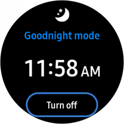
Of course, if in a future update to the galaxy watch, the good night mode gets changed or renamed to wind down (bedtime mode) we'll definitely change it too, but for now, because samsung hasn't released any updates to the galaxy watch to indicate that this has changed we can't change it.
• One UI uses circle buttons
View attachment 14981
when we have to select one thing from multiple options (eg- selecting ringing tone, notification sound) whereas,
View attachment 14984
switches are used when we have to turn something on or off . So it makes no sense to put circle buttons in alarm as we have to turn them on or off, not select any one of them.But for dnd,circle buttons are correct as we have to choose one from 3 options
But here's the problem:
the mi band 4 has a lot of limitations and it's lot more limited than the mi band 5, so in such cases we don't have any workarounds. If you want me to tell you a more detailed error, Here's why:
in the resources for the mi band 4, there are some selection icon files:

 (in the mi band 4, these selection icons are only used in water-lock mode (Screen Lock) and no where else in the os.)
 (these selection icons are placed more commonly in alarm and good-night mode (DND))
and the icons' sizing can be changed to for example fit the correct selection icons, but then there are multiple other problems to fix:
-The selection icons' pixels will be put on top of the text so the text will become unreadable
-the icon doesn't get centered like the mi band 5 so in some cases it won't be aligned with the other elements in the section that it's in
-Because There's only one of this selection icon pair, if we change
to
and sacrifice all the other things, then we'll get the biggest problem, the goodnight mode will be also affected by this change so we'll get about 3 UI issues made and 1 resolved UI issue. In the past, we really wanted to change this, because we also felt the needed change, but unfortunately, with a messy and limited OS like mi band 4, Sometimes you have to sacrifice one thing for many other things to go right, sorry again. But we hope this explanation was helpful for why this can't be done.
• Icon of watchfaces (band display) looks odd one out because it has gradient colors and all other icons in more section have flat colors. And I think these icons would look better for watchface icon
View attachment 14985
View attachment 14986
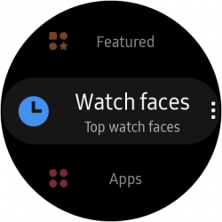
and we're thinking about whether we can make a custom circular icon (that is the style of one ui 3) and replace the galaxy themes icon with that but that idea is still in the decision-making process so We'll inform you what our decision was. We may even use your idea.
But after all this time writing this explanation (70 minutes) we still thank you for at least telling us these suggestions. We know that some of these cannot be applied or they have to be thought about, but that's because we want the best problem free and accurate theme (we're not saying that the theme doesn't need changing, it definitely needs some changes like maybe the heart rate icon and animation and ... ) and when people or even when we see these ideas, we sometimes reach roadblocks because of the limitations we have. For example, A long time ago, I wanted to change the numbers' colors in every part of the ui to match the galaxy watch, but I soon found out that that part of the UI is stored in the main firmware which cannot be changed because of its certificate.
We really appreciate your help in this and we always try to make as many good and helping changes to this theme. Thanks again for your ideas, please keep giving us more of your ideas so we can apply some of them to theme. Together , we can make the best theme possible.
Thankyou for giving me response and literally spending an hour writing me reply? You told that you are finding an icon for watchfaces. What about this one which I made
View attachment 14999
- Joined
- Nov 25, 2020
- Messages
- 48
- Likes
- 18
- Points
- 18
Please accept one request dude. Please add galaxy fit 2 navigation buttons in mi band 4. I know that previously you have already told that you will be adding it in the separate galaxy fit 2 version theme for mi band 4 but you seriously don't have any time to do that. You have also told that you will make a greyscale version of this theme to save battery. You also told that as soon as 1.0 version gets launched, you will port this theme to mi band 3 and 5. And you are working on many secret projects too. Current navigation buttons which you have applied in this theme are not so good. It would be much better if you put Galaxy fit 2 navigation buttons in this theme and merge all your One UI ideas to create the best theme. Please consider this idea and stop making a separate firmware with galaxy fit 2 theme as both the firmwares have the same objective and feel (One UI). The rest is upto you. Thankyou
Please accept one request dude. Please add galaxy fit 2 navigation buttons in mi band 4. I know that previously you have already told that you will be adding it in the separate galaxy fit 2 version theme for mi band 4 but you seriously don't have any time to do that. You have also told that you will make a greyscale version of this theme to save battery. You also told that as soon as 1.0 version gets launched, you will port this theme to mi band 3 and 5. And you are working on many secret projects too. Current navigation buttons which you have applied in this theme are not so good. It would be much better if you put Galaxy fit 2 navigation buttons in this theme and merge all your One UI ideas to create the best theme. Please consider this idea and stop making a separate firmware with galaxy fit 2 theme as both the firmwares have the same objective and feel (One UI). The rest is upto you. Thankyou
And also the name of the theme is "Galaxy watch" so we can't change it. So that's why we promised to make a galaxy fit 2 version that has that changed and even more. Also the grayscale version is gonna be made after version 1.0. We assure you that we'll make both of them.


- Joined
- Nov 25, 2020
- Messages
- 48
- Likes
- 18
- Points
- 18
Dude I think that the More section should be renamed to More Apps or Other Apps
• The name More because outside the more section also there are apps like notifications and weather
• The name Apps because Timer, Stopwatch, Alarm, Samsung Music, Settings, etc which are present in more section are treated as individual apps in galaxy watch
• The name More because outside the more section also there are apps like notifications and weather
• The name Apps because Timer, Stopwatch, Alarm, Samsung Music, Settings, etc which are present in more section are treated as individual apps in galaxy watch
- Joined
- Nov 25, 2020
- Messages
- 48
- Likes
- 18
- Points
- 18
We didn't change the "more" naming yet because we're still thinking about the right naming. The naming of the icon that we used for the "more" section in the galaxy watch is "Recent apps" and we're still thinking if that special translation needs to be applied. Of course we'll inform you if we changed it to "recent apps" so stay tuned!!
Ya but even if that icon is of "Recent apps" in galaxy watch, it is simply not applicable to be named recent apps in mi band as mi band 4 does not keep recent apps open and seperated and "More apps" name makes more sense than recent apps. When you start thinking about naming that section, please consider this suggestion once
- Joined
- Nov 25, 2020
- Messages
- 48
- Likes
- 18
- Points
- 18
But it's also not more apps in any way so I think we shouldn't name it for now.
(Sorry for making it a big issue) See bro my point is weather is an app (both in phones and watch) and same with notifications (messages) and under the "more apps" section, there are more apps like timer, stopwatch, alarm, settings (you only say they are apps or not). Samsung also treats them like individual apps only, then how "more apps" name makes no sense? Two apps when scrolling down (Weather and notifications), and all other apps (Timer, stopwatch, find my mobile) in more apps section?
Trusted Store


Our Telegram Channel