RES Galaxy Watch 3 (One UI 2.5) Beta theme for Mi band 4 v93 to v97
- Thread starter He5am2099
- Start date
- Resources Version
- 97
- Joined
- Nov 25, 2020
- Messages
- 48
- Likes
- 18
- Points
- 18
Please can you increase the icon sizes in more section as they are tooooo small and the main motive of One UI is to make visibility better. I know that if you increase too much it will look bad so increase only a little bit (I flashed the firmware today and its amazing)
Update: after the long wait, we're finally starting to make prebetas available for whoever wants them, for both the galaxy watch theme and the oppo watch theme. You can request the prebetas from us and we'll send them to you. To get galaxy watch theme betas, message me privately and if you already requested and still want to receive them, just send number 1 in the conversation and we'll send the prebetas afterwards. But most importantly, if you want the oppo watch theme prebetas, message VanshPratap and he'll send them to you.
Thank you for supporting us so much. Were you trying our best to make the best themes on geekdoing.
Thank you for supporting us so much. Were you trying our best to make the best themes on geekdoing.
Update:
Some big news is coming. After the completion and release of version 1.0 of the galaxy watch theme, we'll work on making this theme international. What does that mean? That means that anyone from any country can download our theme with his favorite language and use the theme just as simply as the English version. So, to make this project possible, we need a little help. From who do you ask? From everyone.
•What requirements do you need to qualify as a translator?
You'll need to be fluent in both English and 1 other foreign language as great as your main language with the best grammar possible and need to be able to translate English perfectly to that language with its cultural use and ... applied.
Any of the select languages are helpful if known:
-Arabic ar
-Czech
-French fr
-German de
-Greek
-Indonesia in
-Italian it
-Japanese ja
-Korean ko
-Polish pl
-Portuguese pt
-Romanian
-Russian ru
-Spanish es
-Thai th
-Turkish
-Ukranian
-Vietnamese vi
-Chinese zh-rCN
If you know any languages other than the ones on this list, tell us and we may even make a custom version of the theme just for that specific language.
If you have all of these perquisites, we'll move on to the next question.
•What should you do if you want to help?
Just contact us privately and we'll answer as soon as we can.
and now, let's answer the last and most important question of them all.
•What are you exactly going to do?
You have 2 options for your partnership with our theme.
1. You can make new translations simultaneously with the theme development. What that means is that every time we make a new version of the theme, 2-3 days before release, we'll send you the firmware and the translations to check and sync the foreign language with the original translations and send the translations back to us in the matter of 2-3 days. This process may be hard to keep up so we only advise people who have a lot of time and are hardcore fans to select this option.
2. You can simply wait until the version 1 releases and then translate all of the English translations. This option is recommended for mostly everyone.
You can choose any of these options and we'll adjust everything accordingly.
Thanks again for reading this long text. We want our themes to be accessible to everyone and with only your help, we can reach that dream. So, by supporting us, you make us happier to continue on working and creating new and innovative things. Thank you.

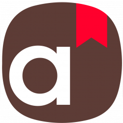
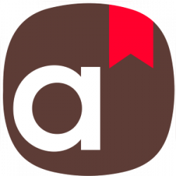
(Samsung Dictionary)
(the icon below was a remade icon from the original Samsung Dictionary app to match the one UI styling. The original icon looked like this: )
)
Stay tuned for more news!!!!
Some big news is coming. After the completion and release of version 1.0 of the galaxy watch theme, we'll work on making this theme international. What does that mean? That means that anyone from any country can download our theme with his favorite language and use the theme just as simply as the English version. So, to make this project possible, we need a little help. From who do you ask? From everyone.
•What requirements do you need to qualify as a translator?
You'll need to be fluent in both English and 1 other foreign language as great as your main language with the best grammar possible and need to be able to translate English perfectly to that language with its cultural use and ... applied.
Any of the select languages are helpful if known:
-Arabic ar
-Czech
-French fr
-German de
-Greek
-Indonesia in
-Italian it
-Japanese ja
-Korean ko
-Polish pl
-Portuguese pt
-Romanian
-Russian ru
-Spanish es
-Thai th
-Turkish
-Ukranian
-Vietnamese vi
-Chinese zh-rCN
If you know any languages other than the ones on this list, tell us and we may even make a custom version of the theme just for that specific language.
If you have all of these perquisites, we'll move on to the next question.
•What should you do if you want to help?
Just contact us privately and we'll answer as soon as we can.
and now, let's answer the last and most important question of them all.
•What are you exactly going to do?
You have 2 options for your partnership with our theme.
1. You can make new translations simultaneously with the theme development. What that means is that every time we make a new version of the theme, 2-3 days before release, we'll send you the firmware and the translations to check and sync the foreign language with the original translations and send the translations back to us in the matter of 2-3 days. This process may be hard to keep up so we only advise people who have a lot of time and are hardcore fans to select this option.
2. You can simply wait until the version 1 releases and then translate all of the English translations. This option is recommended for mostly everyone.
You can choose any of these options and we'll adjust everything accordingly.
Thanks again for reading this long text. We want our themes to be accessible to everyone and with only your help, we can reach that dream. So, by supporting us, you make us happier to continue on working and creating new and innovative things. Thank you.
(Samsung Dictionary)
(the icon below was a remade icon from the original Samsung Dictionary app to match the one UI styling. The original icon looked like this:
 )
)Stay tuned for more news!!!!
Attachments
-
19.2 KB Views: 124
-
5.9 KB Views: 9
-
1.4 MB Views: 10
Last edited:
Dude I found an icon which can replace the tick mark (correct) icon when we clear the notifications. It was just an empty white icon and did not look good.This is better
View attachment 15036

Last edited:
And can you change reset and restart icon.because both look the same
