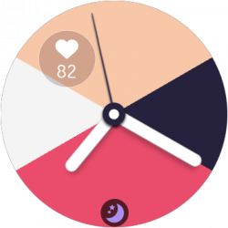
RES Galaxy Watch 3 (One UI 2.5) Beta theme for Mi band 4 v93 to v97
- Thread starter He5am2099
- Start date
- Resources Version
- 97
Update:
We've cropped the image for both the volume control and name of the song that's being played is displayed correctly.
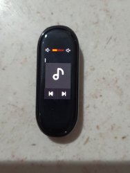
The only things displaying incorrectly are the play and pause buttons:
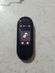
We'll try our best to fix all these issues and make the best experience possible on this device. So stay tuned!!!
We've cropped the image for both the volume control and name of the song that's being played is displayed correctly.

The only things displaying incorrectly are the play and pause buttons:

We'll try our best to fix all these issues and make the best experience possible on this device. So stay tuned!!!
- Joined
- Nov 25, 2020
- Messages
- 48
- Likes
- 18
- Points
- 18
Looks Great. As soon as you fix the play and pause buttons, please try to make the icons curved from corners as it would give it the feel of One UI and try that the size of music icon in the middle should become small when music is paused and normal when music is being played (like how original icon behaves in samsung music app when song is played and paused)
Looks Great. As soon as you fix the play and pause buttons, please try to make the icons curved from corners as it would give it the feel of One UI and try that the size of music icon in the middle should become small when music is paused and normal when music is being played (like the original icon behaves in samsung music app)
- Joined
- Nov 25, 2020
- Messages
- 48
- Likes
- 18
- Points
- 18
Is it possible to change that top volume indicator panel accent color and style to One UI's default accent colors?
Is it possible to change that top volume indicator panel accent color and style to One UI's default accent colors?
- Joined
- Nov 25, 2020
- Messages
- 48
- Likes
- 18
- Points
- 18
Did you change the icons inside Silent (ringing tone) section or changed the battery animation? It is very hard for us to know how everything looks because all the Youtube reviews of this theme are based on older versions. When you release the next update in this firmware, please take a short video by going into each and every settings and sections. Thankyou
- Joined
- Aug 31, 2020
- Messages
- 73
- Likes
- 16
- Points
- 18
Did you change the icons inside Silent (ringing tone) section or changed the battery animation? It is very hard for us to know how everything looks because all the Youtube reviews of this theme are based on older versions. When you release the next update in this firmware, please take a short video by going into each and every settings and sections. Thankyou
Did you change the icons inside Silent (ringing tone) section or changed the battery animation? It is very hard for us to know how everything looks because all the Youtube reviews of this theme are based on older versions. When you release the next update in this firmware, please take a short video by going into each and every settings and sections. Thankyou
- Joined
- Nov 25, 2020
- Messages
- 48
- Likes
- 18
- Points
- 18
(Maybe you've done it already) Please rename the Ringtone (silent) section to Sound mode or Sound like One UI and change its icon to Quick panel Sound icon or One UI 3 sound and vibration icon in settings. Also, add Silent icon when the phone is silent, rename Silent to Mute and change Alarm is on to Sound somewhat like-
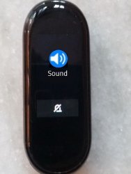
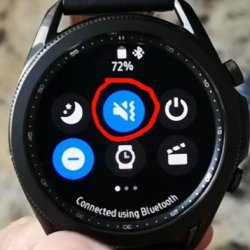


(Maybe you've done it already) Please rename the Ringtone (silent) section to Sound mode or Sound like One UI and change its icon to Quick panel Sound icon or One UI 3 sound and vibration icon in settings. Also, add Silent icon when the phone is silent, rename Silent to Mute and change Alarm is on to Sound somewhat like-
View attachment 15016
View attachment 15015


